Creating graphs with dumped telemetry data
Passing the command-line option -e or --export-telemetry, will dump all received telemetry packets into a file called telemetry_log.json in the active directory.
This file's structure looks like
[
	{"t_elapsed_ms":3257,"entries":{"Telemetry key": "value", "Some otherkey": "1.0", ...},
	...
]
Note that:
- Not all elements of the array of telemetry packets contain your custom defined values. Some will only contain keys that are added by REV, such as
$System$Warning$,$System$None$, andStatus.Battery Voltage [V]is also a special one, which contains the last reported voltage on the battery. - All values are sent as strings, regardless of their actual type. You'll need to manually parse them
- Certain telemetry entries will have weird keys, such as
\u0000Ƅ. These keys (starting with a unicode null character) are used for telemetry lines (telemetry values that have no key)
You can then parse this file in e.g. python, to draw a graph with matplotlib:
Example code:
import matplotlib.pyplot as plt
import sys
import json
# sys.argv[1] means we'll open the file passed
# as our second argument
#
# You'll run this as python3 main.py myfile.json
with open(sys.argv[1], 'r') as file:
# Read the file and parse it as json
data = file.read()
parsed = json.loads(data)
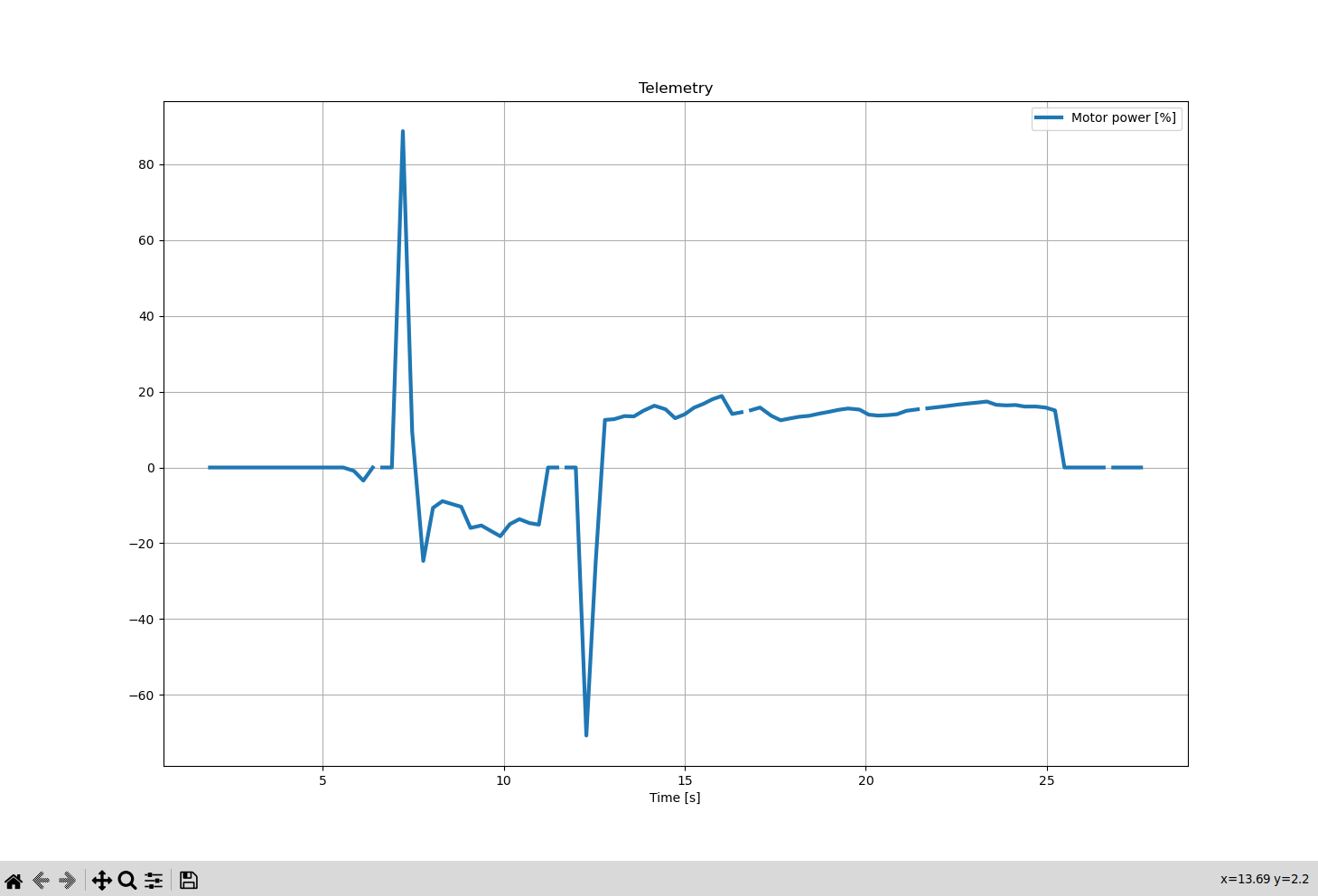
# Let's say we want to graph our motor power over time
# and we have a line in our robot's code:
# telemetry.addData("Motor power", motorPower)
# where motorPower is a float, from -1.0 to 1.0
power = list()
time = list()
# these two lists need to have the same number of elements, and the nth element in one
# has to correspond to the nth element in the other
for packet in parsed:
# For the values of time, take every packet's time in seconds
#
# We'll map all our y values to this; this is so matplotlib knows at what time we received what data
time.append(float(packet["t_elapsed_ms"]) / 1000.0)
# Potentially get the value from the packet's entries
power_e = entry["entries"].get("Motor power")
# If the entry contained that value
if power_e is not None:
power_as_float = float(power_e)
# This is optional, map values of (-1.0, 1.0) to (-100.0, 100.0)
# This is to show how you can manipulate data before adding it to the list
power_as_float = power_as_float * 100.0
power.append(power_as_float)
else:
# If it didn't, let matplotlib know
# If we didn't append None here, we'd mess up the 1 - 1 mapping of power to time
power.append(None)
fig, ax = plt.subplots()
ax.plot(time, power, linewidth=3, label="Motor power [%]")
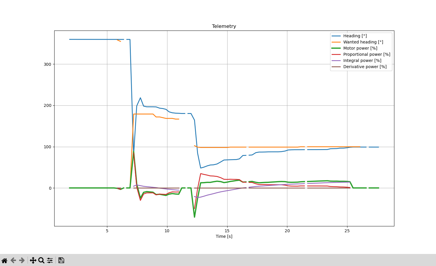
# If you want to add more plots, add another list, add its elements in the above loop, then call
# ax.plot(time, my_data, label="Something")
# These just make things look a bit nicer, ax.legend() is very useful
#
# plt.show() actually shows the graph
#
# you should take a look at matplotlib's docs
ax.set_xlabel("Time [s]")
ax.set_title("Telemetry")
ax.legend()
ax.grid(True)
plt.show()